There's a problem most QA teams share, and it's not a tool problem or a process problem. It's a visibility problem.
You run hundreds of tests. You catch bugs before they reach production. You save your team hours of manual regression every week. But when sprint review comes around, all anyone sees is a green check or a red X — and no one really understands what's behind it.
This post is about fixing that. And you don't need to be a senior automation engineer or a data analyst to do it. You just need three slides and the willingness to tell your story.
The Slides That Do the Talking
I put together a free Google Slides template that any QA — regardless of their technical background — can copy and fill in with their own numbers:
It has three slides. Let me walk you through what each one is really saying — not just what it shows.
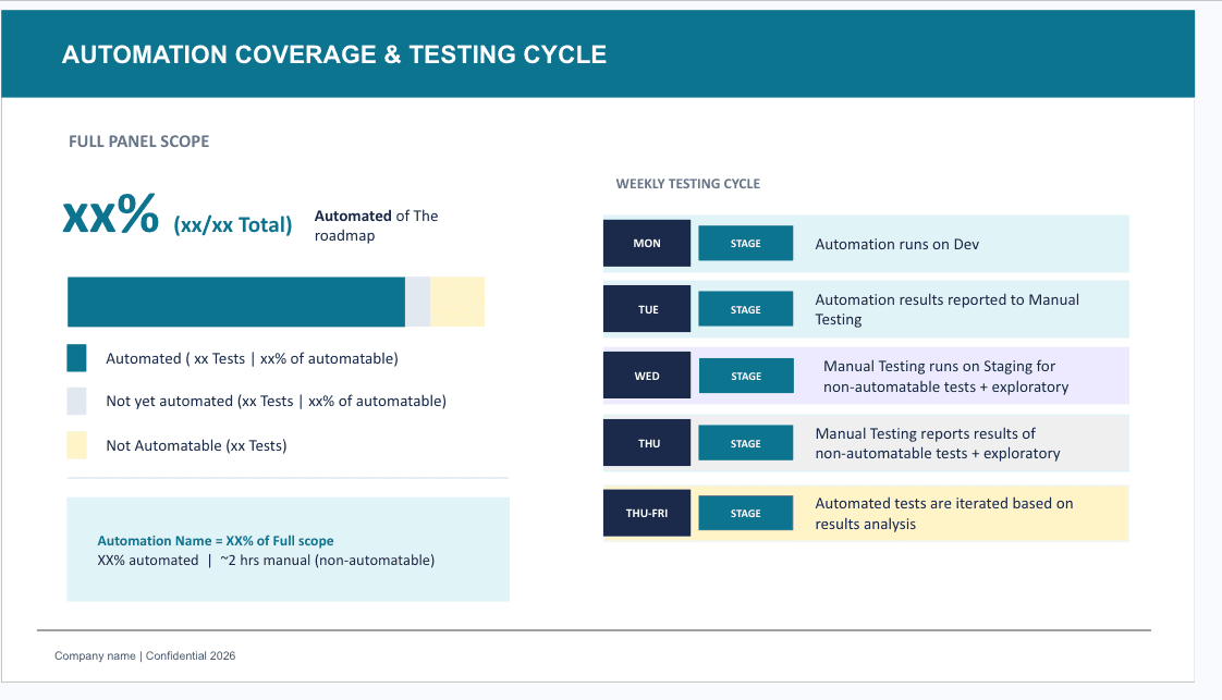
Slide 1 — Automation Coverage & Testing Cycle
This slide answers the question every stakeholder is secretly asking: "Can we trust the automation?"
What it shows:
- What percentage of your roadmap is covered by automated tests
- The split between automated, not-yet-automated, and non-automatable tests
- The weekly testing rhythm — when automation runs, when manual testers get involved, and when results loop back into iteration
Why it matters:
Most teams treat automation coverage as a developer metric. It's not. It's a product quality metric. When you show a stakeholder that 75% of your test suite runs automatically every Monday on Dev — and that by Thursday, manual testers are only focused on exploratory work that can't be automated — you're showing them a mature, intentional process, not just "we run Cypress."
The story behind the numbers:
The weekly cycle on the right side of the slide is the real gem. It reframes your Manual Testers not as a fallback for when automation fails, but as specialists who own the territory automation can't reach: edge cases, UX intuition, exploratory sessions. That's a completely different narrative than "we automate some things and test the rest manually."
Slide 2 — Automation Impact & Defect Detection Trend
This slide answers the harder question: "Is this worth it?"
What it shows:
- Manual testing hours saved (per week, per environment, per month)
- Pass rate and flakiness rate
- Feature risk coverage (mid risk, high risk)
- The mapping between user stories (UHs) and automated tests
- A monthly trend of bugs found by automation
Why it matters:
This is where your automation stops being a technical asset and becomes a business argument. Hours saved is money saved. Bugs caught by automation before a human ever touches it is risk reduced. Flakiness rate tells everyone that you're not just running tests — you're maintaining them.
The monthly bug trend chart is especially powerful in retrospectives. You can point to the months where automation caught more, correlate it with release cycles, and use it to argue for more coverage investment.
Slide 3 — Outstanding Items & Next Steps
This is the most underrated slide of the three.
What it shows:
Three prioritized action items, each with a small icon, a title, and a one-line explanation.
Why it matters:
It shows that QA isn't reactive. You're not just responding to tickets — you have a roadmap. You know what's missing, you know the impact, and you're already working on it. This slide turns your team from a support function into a strategic partner.
A Quick Guide: How to Fill This In (Even If You're Not That Technical)
You don't need to run queries against a database to fill these slides. Here's how to get the numbers without the complexity:
Step 1 — Count your tests
Open your test management tool (TestRail, Zephyr, Xray, even a spreadsheet). Filter by:
- Automated → count them
- Manual, could be automated → count them
- Manual, cannot be automated → count them
That gives you the three numbers for the coverage bar in Slide 1.
Step 2 — Track a week of testing
For one full week, note when automation ran and when your team switched to manual. Write it down in plain language. That becomes your Weekly Testing Cycle on the right side of Slide 1. You're not inventing a process — you're documenting the one you already have.
Step 3 — Ask your CI/CD pipeline for the basics
If your team uses GitHub Actions, Jenkins, GitLab CI, or similar, ask a developer (or check the UI yourself) for:
- How many test runs passed vs. failed last month → that's your pass rate
- How many times did a test fail and then pass without any code change → that's your flakiness
You don't need to calculate anything. Just count.
Step 4 — Pull the bug report
Go to your bug tracker (Jira, Linear, whatever you use). Filter by:
- Bugs found in automation runs (usually tagged with a label like
found-by-automationor reported by your CI bot) - Group them by month
That's your bar chart. Eight months of data is enough to show a trend.
Step 5 — Calculate the hours saved
This is the most impactful number and the simplest to get.
Ask yourself: "If we hadn't automated this test suite, how many hours would a manual tester spend running these tests per cycle?"
Multiply that by the number of cycles per week, and by the number of environments you run on. You'll surprise yourself.
Step 6 — Pick your top 3 outstanding items
Don't overthink this. What are the three things your team knows need to happen next? More coverage? Reducing flakiness? Mapping tests to user stories? Write them down. That's Slide 3.
Why Storytelling Matters in QA
Here's the uncomfortable truth: a QA team that does excellent work but communicates it poorly will always lose the budget argument to a team that does average work but presents it clearly.
Your automation is already doing impressive things. The gap is between what it does and what the people around you know it does.
These slides are not a report. They're a conversation starter. When you walk into sprint review or a quarterly planning meeting with these three slides, you're not just sharing data — you're changing how your team is perceived.
Manual testers aren't the "slow path." They're the specialists. Automation isn't a checkbox. It's a force multiplier. And QA isn't a cost center. It's where product quality lives.
Tell that story. Tell it with slides. Tell it every sprint.
Get the Template
Make a copy, fill in your own numbers, and share it with your team. If it helps you start a conversation you've been wanting to have, that's exactly what it's for.
Found this useful? Share it with a QA who needs a better way to communicate their impact. And if you want more templates, guides, and straight talk about quality engineering — you're already in the right place.